Navigation
Install the app
How to install the app on iOS
Follow along with the video below to see how to install our site as a web app on your home screen.
Note: This feature may not be available in some browsers.
More options
You are using an out of date browser. It may not display this or other websites correctly.
You should upgrade or use an alternative browser.
You should upgrade or use an alternative browser.
Simple Logo Design
- Thread starter Merciless
- Start date
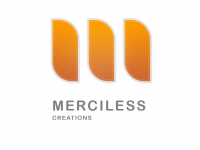
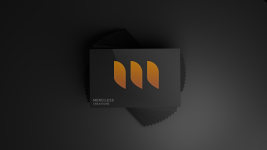
Thank you for your feedback. The 3 "Shapes" are made to look like an "M". The logo you got from google a lot of people like that sort of design but its very generic. But it does reflect "Merciless" as its a wolf.In my humble opinion, a logo should reflect the name Merciless. That simple logo doesn't do it for me. I pulled an example off a google search to better demonstrate what I mean:
View attachment 272
Yeah thank you, my dad said the same, in this words “what on earth have you put those shapes there for” lol, looking back it’s a very confusing design.Nice design. Once you explained it, I can definitely see how it is meant to look like a M. But I probably wouldn't have got that without you telling me about it, to be honest.


